
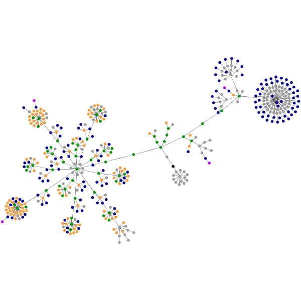


 The graphics on this page shows the way a webpage is written. The first one on the left is the page you're reading (prior to making this post, which should change the structure slightly). I suspect that many Blogger-driven blogs will look the same, due to common blogger templates and such.
To the right of that, with lots of red, is the structure of the International Society for Neuroethology webpage, which I oversee but did not write. The preponderance of red indicates a lot of tables being used to structure the page.
Interestingly, but not surprisingly, authors seem to have distinct styles. The third and fourth graphs are both pages I created -- my academic home page (left) and one of my hobby pages (right). The substantial amount of blue and orange in the bottom two graphs shows that I like links and text, respectively.
The original description of the project, and a link to make a graph of any website you want) is here. It's really quite fun to watch the program run, as the graphic "grows" out, very quickly at first, then finally settling down to a pattern. More discussion, including some very helpful interpretation, is found on this discussion thread on Edward Tufte's website.
No comments:
Post a Comment